
The Challenge
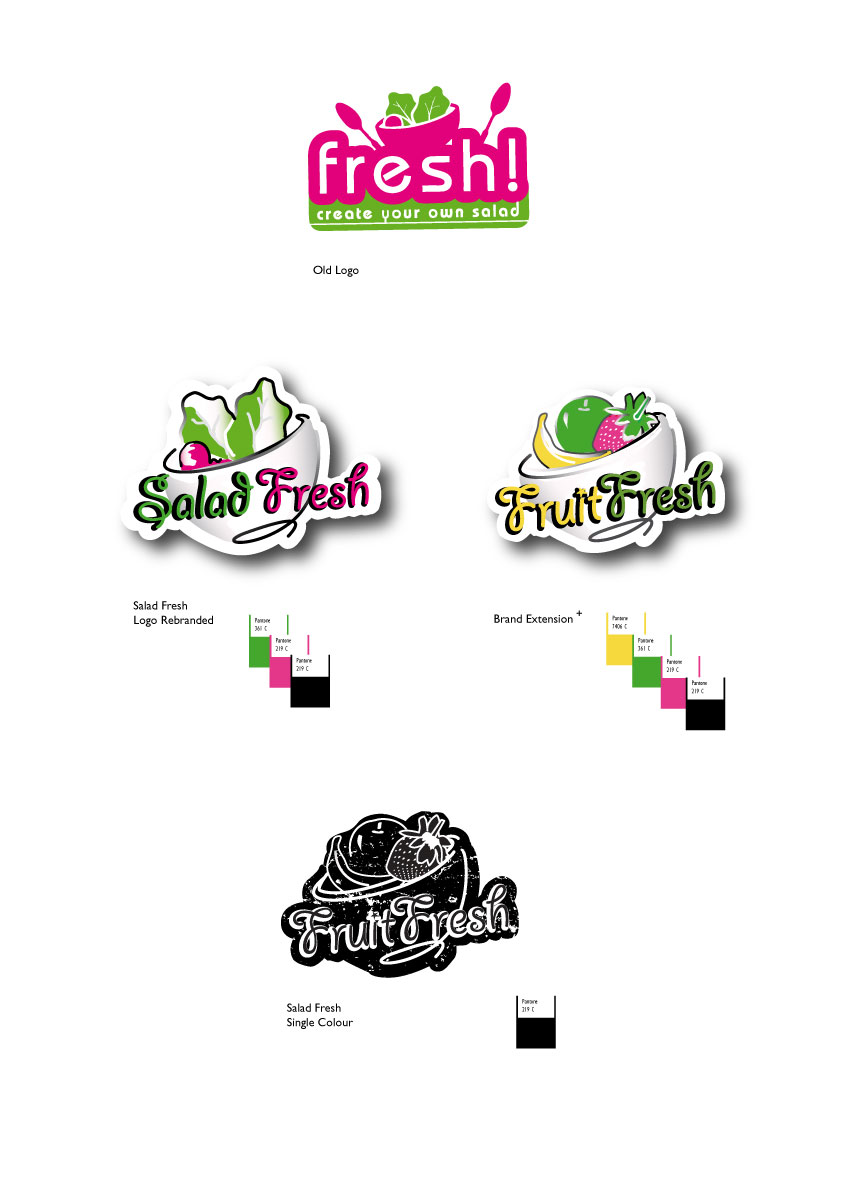
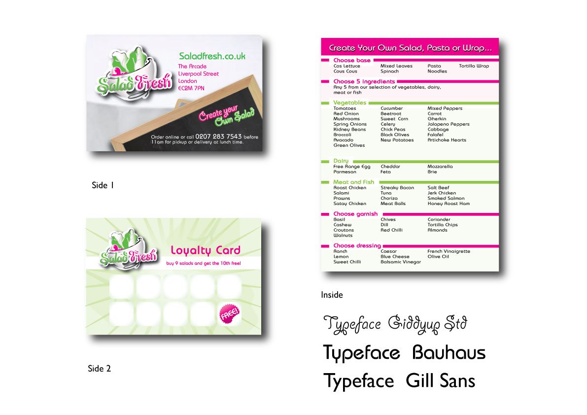
After examining the company logo I have decided to address the typeface and changed it to a light bistro style of text relating to the company desire of “homely” and livened up and modernised the logo making it brighter and clearer by adjusting the use of colour. To keep in line with the new re-brand I established the brands extension name to Fruit Fresh. Using a similar theme of colour I made it clear visual distinction between the two designs (via the bowls contents) but also by distinguishing the brands name in different colours. Once these brand logos were redesigned I create a range of company stationary to reaffirm the company’s message and core values.